

F E E L I N G C O L O R S
COLOUR THEORY & PSYCHOLOGY FOR BRANDING
Whether it's being used in branding, fashion, or decor (to name just a few applications), colour has an immense power to evoke emotion and control how a brand is perceived. Every colour triggers an emotional and psychological response, so it's important to have an understanding of what each colour represents before committing to a specific palette for your brand. It’s how we bring to life how we want our brand to feel, which is something you’ll hear me talk a lot about when it comes to branding.
Colour plays an important role when it comes to defining your visual strategy and designing your brand, and whether you’re styling photos for a brand shoot, working on a brand identity design, or some other creative application, I think there’s a lot of value in having a solid understanding of colour theory and psychology.
Which is why we’re here today!
I’ve pulled together a summary of the core colours (think the purest shades of the rainbow, for the most part), and compiled a list of tone words for each that represent the feelings and emotions often associated with each of the colours. Beyond that, I’ve also included a set of visual references for each, with a mix of various sources and applications, as I’m a strong believer in pulling inspiration from many different places and I wanted to show a range of how they can be interpreted.
Take a look at what the various colours represent, and hopefully this will give you the understanding you need to be able to choose brand colours based on which ones align with your vision and values — and again, how you want your brand to feel.
B L A C K
Black, a color of power and elegance, often signifies authority, making it a perfect match for fashion, editorial, and luxury brands.
Its sleek and timeless appeal can evoke both sophistication and luxury, but its versatility also allows it to represent mystery or even grief. In branding, black stands as a symbol of exclusivity, premium quality, and confidence, making it a go-to for brands aiming for a bold and distinctive identity.


T O N E W O R D S
Bold
Powerful
Sophisticated
Dramatic
Formal
Graphic
Uncompromising
Classic
Elegant
Distinctive
Mysterious
Secretive
Secure
Controlled
Protective
Exclusive
Glamourous
Luxurious
Opulent
Authoritative
Serious
B R A N D S T H A T B E N E F I T S
Ideal for high-end luxury brands, tech products, and editorial or fashion-inspired brands.
W H I T E
White, often seen as a symbol of purity and simplicity, offers a canvas of endless possibilities. Its inherent minimalistic quality can be both a challenge and an opportunity for brands, urging them to think of texture, layering, and luminance. In branding, white stands out as a symbol of freshness, new beginnings, and clarity, making it ideal for brands aiming for a clean, modern, and refined image.


T O N E W O R D S
Pure
Clean
Fresh
Imagination
Goodness
Clear
Refined
Elegant
Easy
Hope
Innocence
Illuminating
Ethereal
Light
Minimalist
Modern
Peace
Simplicity
Airy
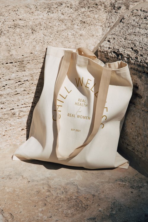
Suitable for minimalist brands, like beauty, health and wellness products, home decor or brands in the wedding industry.
B R A N D S T H A T B E N E F I T S
G O L D
Gold, with its shimmering allure, is synonymous with luxury, success, and opulence. Its radiant glow evokes feelings of warmth, prosperity, and achievement. In branding, gold is not just about luxury; it also signifies quality, tradition, and the best in class. Brands aiming for a prestigious, traditional, or luxurious image often gravitate towards gold to convey their message.


T O N E W O R D S
Successful
Wealthy
Bright
Wise
Opulent
Insightful
Valuable
Luxurious
Glowing
Warm
Prestigious
Generous
Enlightened
Prosperous
Radiant
Rich
Traditional
Powerful
Successful
B R A N D S T H A T B E N E F I T S
Jewelry brands, premium packaging accents, and exclusive clubs or membership.
G R E Y
Grey, a color that exists in a spectrum from soft dove to dark charcoal, exudes calmness, neutrality, and modernity. Its versatile nature makes it a favorite in tech industries and conservative settings, signifying sleek design or luxury. In branding, grey offers a balance between the bold and the understated, making it adaptable to various need.


T O N E W O R D S
Neutral
Calm
Conservative
Open
Mature
Minimal
Sleek
Modern
Futuristic
Stylish
Classy
Cool
Graceful
Reliable
Secure
Intelligent
Balanced
Techy
B R A N D S T H A T B E N E F I T S
Corporate branding, tech companies or startups, and modern home goods or furniture brands.
B R O W N
Brown, with its earthy and rugged undertones, represents depth, richness, and utility. Its natural warmth makes it inviting and approachable, making it a favorite for brands aiming for a handmade, artisanal, or masculine image. In branding, brown signifies durability, reliability, and a handcrafted quality, making it ideal for brands with ties to nature or craftsmanship.


T O N E W O R D S
Rich
Subtle
Earthy
Sensual
Rough
Balanced
Understated
Comforting
Warm
Friendly
Reliable
Grounded
Stable
Wholesome
Raw
Approachable
Organic
Practical
Secure
Strong
Modest
B R A N D S T H A T B E N E F I T S
Handmade goods like leather products or ceramics, rustic cafés and coffee brands, or craft breweries.
P I N K
Pink, a hue that dances between playful innocence and vibrant energy, embodies both softness and strength. Its spectrum, from pastel blushes to bold magentas, can evoke feelings of romance, femininity, and optimism. In branding, pink is versatile, representing everything from youthful exuberance to sophisticated luxury. It's a color that can captivate audiences, making it a favorite for brands aiming to convey warmth, approachability, or modern femininity.


T O N E W O R D S
Playful
Compassionate
Healthy
Beautiful
Sensual
Soft
Grateful
Innocent
Modern
Feminine
Romantic
Nurturing
Hopeful
Gentle
Sweet
Affectionate
Optimistic
Happy
Tranquil
B R A N D S T H A T B E N E F I T S
Youthful brands, innovative tech products, modern fashion labels and beauty brands.
P U R P L E
Purple, a color that has historically been associated with royalty and mysticism, bridges the gap between the calm stability of blue and the fiery passion of red. Its depth and richness can evoke feelings of luxury, creativity, and spirituality. In branding, purple stands out as a symbol of innovation, luxury, and the ethereal, making it a top choice for brands aiming to convey a sense of wonder, elegance, or the avant-garde.


T O N E W O R D S
Wealthy
Abundant
Spiritual
Mysterious
Fantastical
Sophisticated
Visionary
Creative
Soothing
Calming
Luxurious
Majestic
Royal
Ambitious
Intuitive
Sensitive
Honourable
Mystical
Introspective
Successful
Wise
B R A N D S T H A T B E N E F I T S
Innovative products, leadership seminars or books, and luxury goods.
D A R K B L U E
Dark blue, with its deep and resonant tones, exudes trustworthiness, stability, and wisdom. It's a color that speaks to tradition while also resonating with contemporary audiences, evoking feelings of calm, reliability, and authority. In branding, dark blue is a stalwart choice for institutions and businesses aiming to convey professionalism, integrity, and expertise. Its timeless appeal makes it a favorite for brands looking to establish trust and longevity in their industry.


T O N E W O R D S
Harmonious
Reliable
Serene
Authority
Confidence
Loyalty
Intelligent
Cool
Trust
Security
Dependable
Calming
Clean
Logical
Conservative
Integrity
Patience
Peaceful
Stable
Wisdom
Trustworthy
B R A N D S T H A T B E N E F I T S
Financial institutions like banks or insurance companies, and health services and educational platforms.
S E A F O A M
Seafoam is all about embracing the natural and a calming, subtle sense of renewal. Providing clarity, a fresh perspective and a renewed spirit, the colour draws inspiration primarily from the sea and water, offering balance, reflection and a tone of transparency and a calm and clear spirit.
Seafoam's soothing hue can help brands communicate a sense of peace and relaxation signifying new beginnings, fresh perspectives, and rejuvenation. Seafoam's association with the sea and water can help brands emphasize their commitment to natural and organic principles and the clear, light shade of seafoam can symbolize transparency, honesty, and purity in a brand's offerings.


T O N E W O R D S
Healing
Wisdom
Calm
Dreamy
Crisp
Cool
Peaceful
Imaginative
Protective
Soft
Quiet
Sophisticated
Spiritual
Soothing
Innocent
Reassuring
B R A N D S T H A T B E N E F I T S
Spa and wellness brands or retreats, organic products, and coastal hotels or beach resorts.
G R E E N
Green stands as a testament to nature, growth, and renewal. Deeply rooted in the environment, it evokes feelings of tranquility, health, and vitality. In the context of branding, green is a versatile choice, often signifying sustainability, wellness, and balance. Its association with the natural world makes it a favored choice for brands aiming to convey eco-friendliness, organic origins, or a holistic approach.
Furthermore, green's calming undertones can inspire trust and a sense of stability, making it a powerful tool for businesses seeking to establish reliability and authenticity.


T O N E W O R D S
Organic
Natural
Earthy
Calming
Environmental
Positive
Restful
Abundant
Healing
Wealthy
Life-giving
Prosperous
Healthy
Balanced
Relaxing
Compassionate
Fresh
Kind
Generous
Growth
Luck
Restorative
Harmonious
Easy-going
B R A N D S T H A T B E N E F I T S
Eco-friendly products or organic food brands, growth-focused seminars or coaching, and brands that have a tie to nature.
Y E L L O W
Radiating warmth and vibrancy, yellow stands out as a color of optimism, energy, and clarity. In the realm of branding, yellow captures attention and evokes feelings of happiness, positivity, and spontaneity. Its brightness can stimulate mental processes, encourage communication, and inspire creativity.
As a color that's closely associated with the sun, yellow often signifies hope, freshness, and new beginnings. Brands leveraging yellow aim to convey a sense of friendliness, approachability, and youthful exuberance. Whether used as a primary color or an accent, yellow can invigorate a brand's identity, making it memorable and instantly recognizable.


T O N E W O R D S
Sunshine
Energetic
Creative
Friendly
Bright
Happy
Joyful
Lighthearted
Sunny
Caution
Curiosity
Positivity
Warmth
Cheerful
Optimistic
Youthful
B R A N D S T H A T B E N E F I T S
Children’s products and toy brands, creative or advertising agencies, and travel brands.
O R A N G E
A harmonious blend of the energy of red and the happiness of yellow, orange emerges as a color of enthusiasm, creativity, and warmth. In branding, orange is often used to capture attention without the intensity of red, making it both invigorating and approachable. It evokes feelings of excitement, adventure, and a zest for life.
Furthermore, orange is associated with change and movement, often symbolizing transition, innovation, and forward-thinking. Brands that incorporate orange aim to convey a sense of friendliness, confidence, and a fresh perspective. Whether it's to highlight innovation, showcase vibrancy, or create a sense of community, orange is a powerful tool in branding that resonates with those seeking a blend of energy and approachability.


T O N E W O R D S
Energetic
Happy
Positive
Confident
Affordable
Vibrant
Friendly
Aggressive
Fun
Warm
Playful
Cheerful
Optimistic
Social
Passionate
Creative
Curious
Active
Enthusiastic
Excited
Harvest
Youthful
B R A N D S T H A T B E N E F I T S
Fitness brands or gym chains, creative workshops and brands with a focus on innovation, or adventure travel agencies.
R E D
A color of passion, urgency, and vitality, red commands attention like no other. In the world of branding, red is a powerful tool that evokes strong emotions, from excitement and desire to caution and importance. Its intensity can stimulate the senses, raise one's pulse, and even encourage action.
Historically associated with love, danger, and power, red in branding often signifies confidence, boldness, and determination. It's a color that can convey a brand's leadership, innovation, or its revolutionary spirit. Whether used to highlight a sale, create a sense of urgency, or establish a strong brand identity, red is a dynamic choice that resonates with those seeking energy, passion, and impact.


T O N E W O R D S
Powerful
Strong
Action
Adventure
Aggression
Drive
Exciting
Determined
Dynamic
Energetic
Urgency
Courageous
Warmth
Love
Passionate
Assertive
Stimulating
Dangerous
Dramatic
Ambitious
Attention
Confidence
Lively
Warm
Motivated
B R A N D S T H A T B E N E F I T S
Sale banners and e-commerce platforms, call-to-action buttons, emergency services and restaurants or fast food.
Research and case study by Studio Bicyclette.
Align Collective uses this private page for inspirational and educational purposes only.